WEBSITE + APP DESIGN, CONTENT CREATION, ECOMM, UI/UX
AVON HOMEPAGE/LANDING PAGE REDESIGN Avon.com’s UI and site guidelines had many back-end limitations. We worked around those by updating the homepages, landing pages, modernizing the messaging, typography and imagery. By making better use of assets we shot for the catalog, creating “bites” of editorial content, and including video, we were able to make the site an engaging experience, and attract new customers who could now shop with or without a Representative.
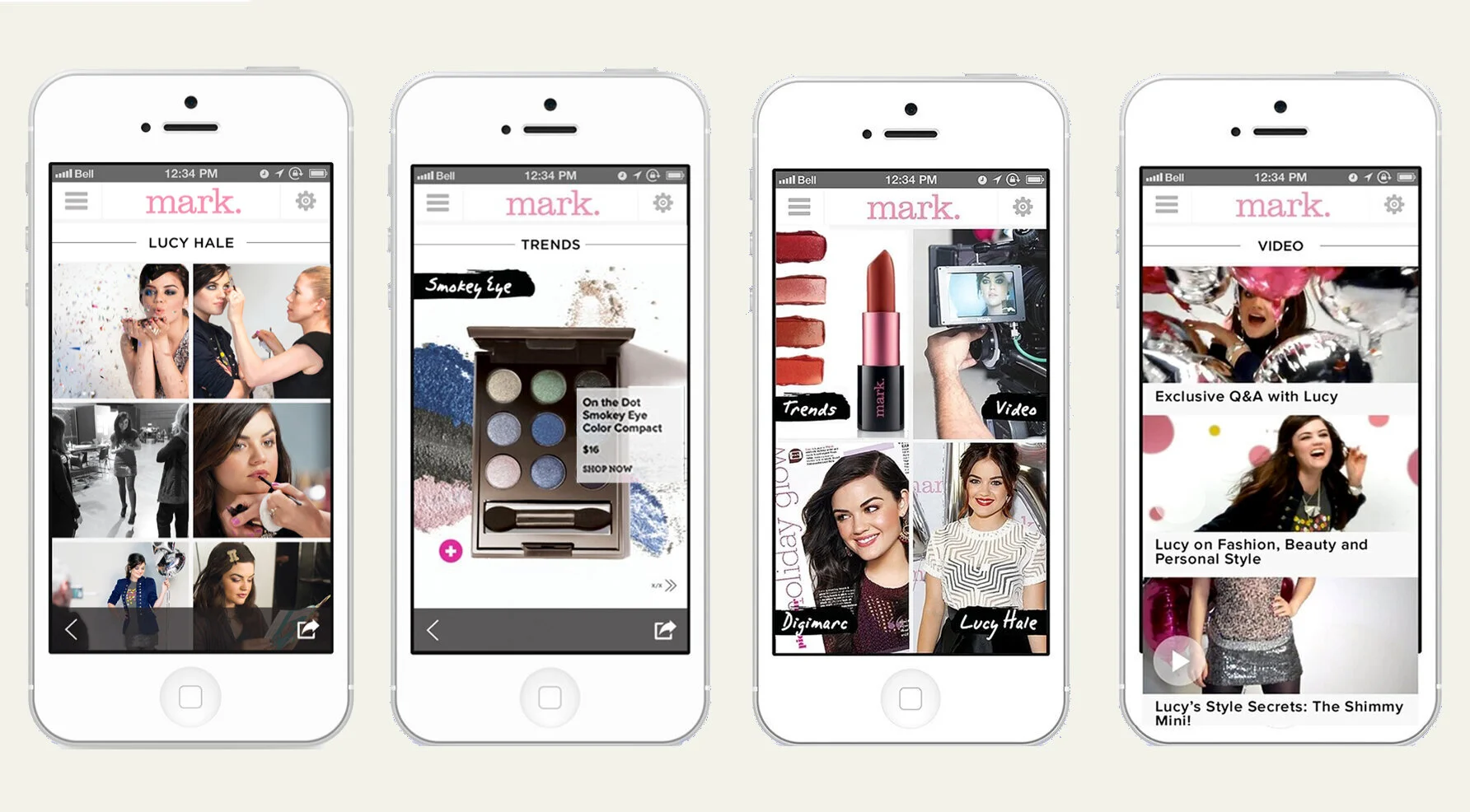
MARK. MOBILE APP: the shoppable app contained exclusive content, video how-tos, a Digimarc scanner, and send/share with friends. App produced by Melanie McLaughlin.
Society of Publication Designers Mobile App Design Award Winner.

MARK SITE REDESIGN (2015) WITH INTEGRATED SOCIAL MEDIA FEED, VIDEO, AND NEW SHOPPING TECHNOLOGY: With a tight budget, and even tighter timeline, the team had the challenge of creating what the digitally native MARK customer would want. We created a social media integrated destination, full of informative, short video content, with many ways to “click and add” so that she would become immersed in the "world of mark." This was light years ahead of Avon.com, and became the benchmark of how to reimagine the Avon.com sites. Site UX + design production: Melanie McLaughlin
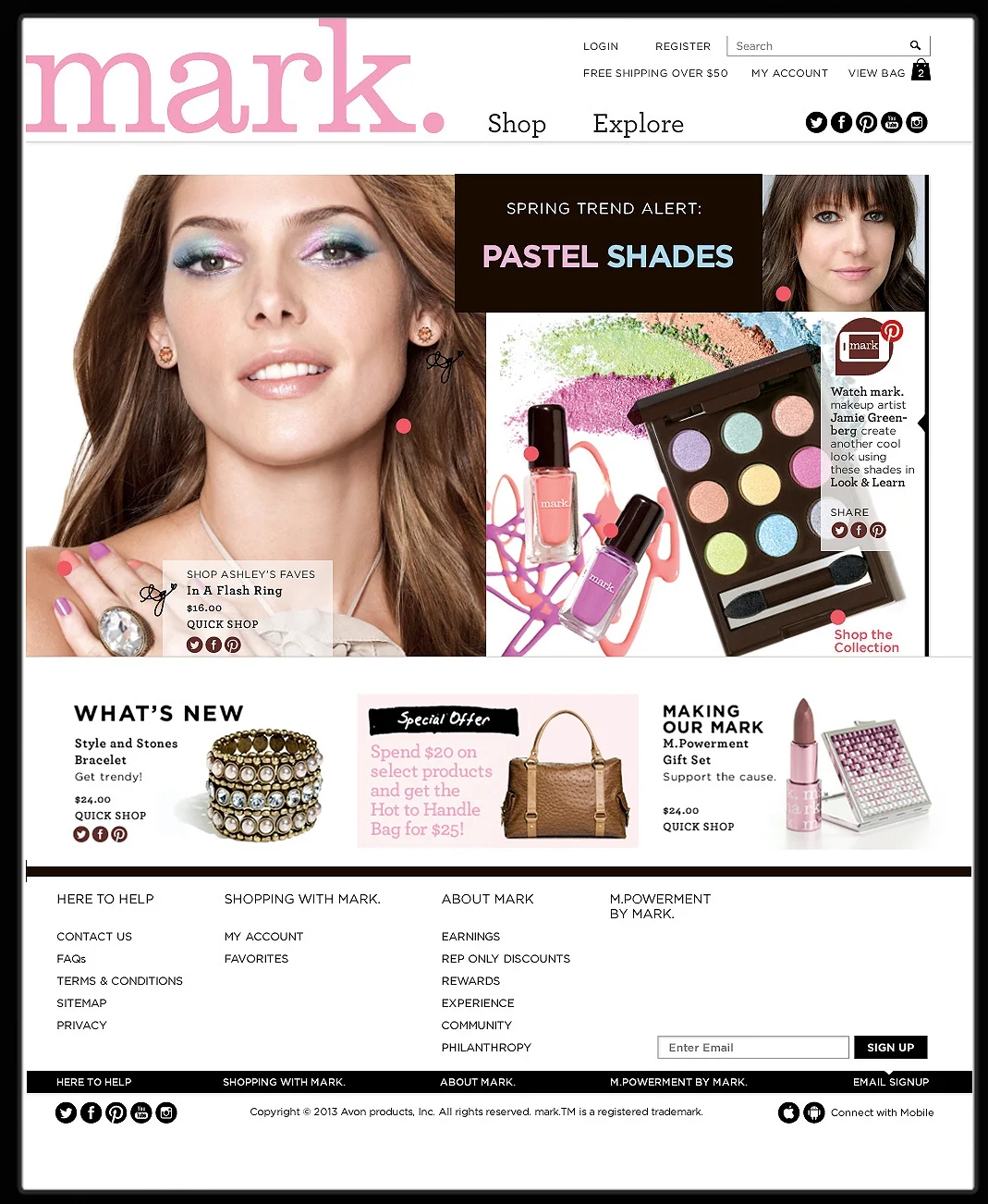
The SHOP landing page had many ways to interact with the main mage. From one photo, you could click to a “how to” video, share, shop, get recommendations from our celebrity makeup artist, etc.
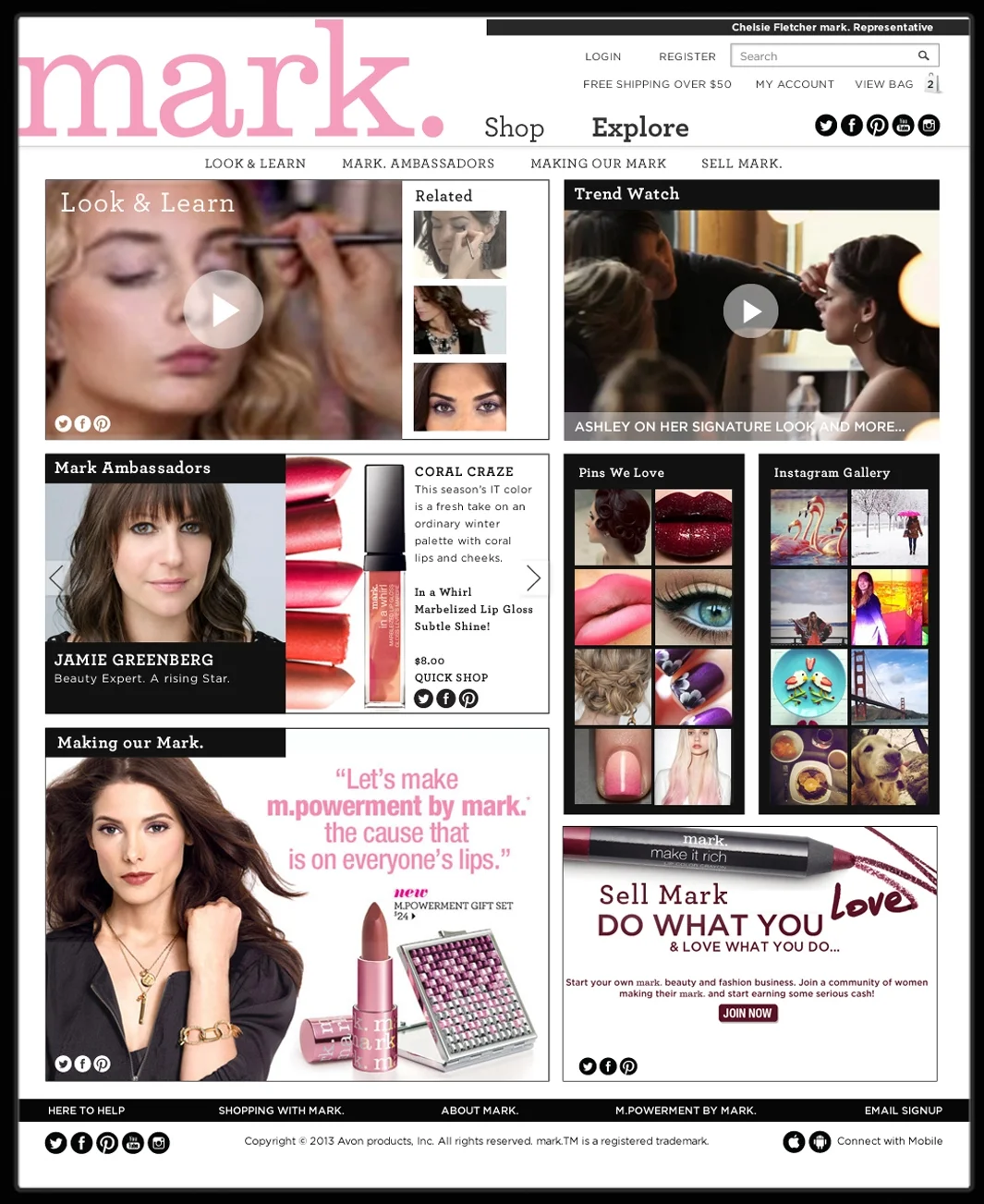
The EXPLORE landing page was the hub of the Mark world, where new content like interviews, “how to” and BTS videos, info about our M.powerment foundation, Pinterest and Instagram feeds, trend stories and more was constantly updated.
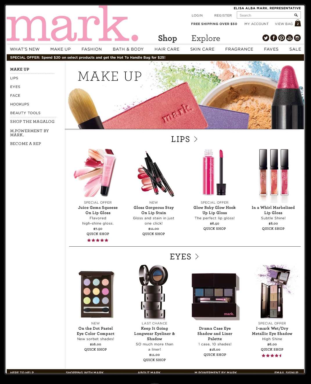
One of our SHOP pages with easy to access side navigation.
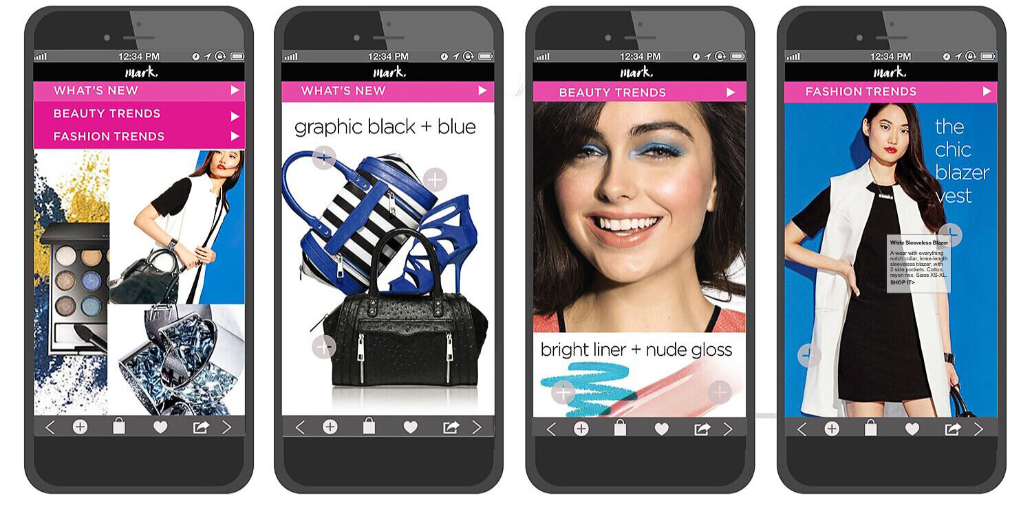
MARK. TREND APP:
A quarterly updated trend app highlights seasonal fashion and beauty trends and allows you to shop mark’s newest products.
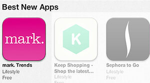
Noted as one of Apple’s
Best New Apps at launch.
STYLEOWNER.COM BRANDING, UI, SITE DESIGN: Styleowner was one of the first “social selling” platforms. It took advantage of the new street style influencer trend, coining the term “Style-preneurs.” These influencers curated and even designed their own stores from an array of style templates. Then they shared their stores on social media. It was the beginning of affiliate marketing: When they sold an item, they got a percentage of the sale. Major fashion influencers, like Man Repeller and Keiko Lynn, plus many leading brands joined the site/platform from the beginning. The site got a lot of coverage and buzz.


HOMEPAGE: in partnership with Teen Vogue, new users would sign up and learn about the site and get a free subscription. From the home page, you could search for an influencer store, or create your own.

Blog/Content area for store owners and shoppers. A place to find out about the latest trends, see which stores are trending, highlight influencers, etc.

I designed over 20 “storefronts” for the launch of the site, based on various style personalities for the “Style-preneurs” to choose from.
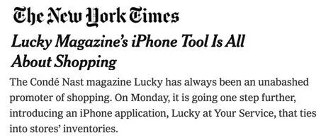
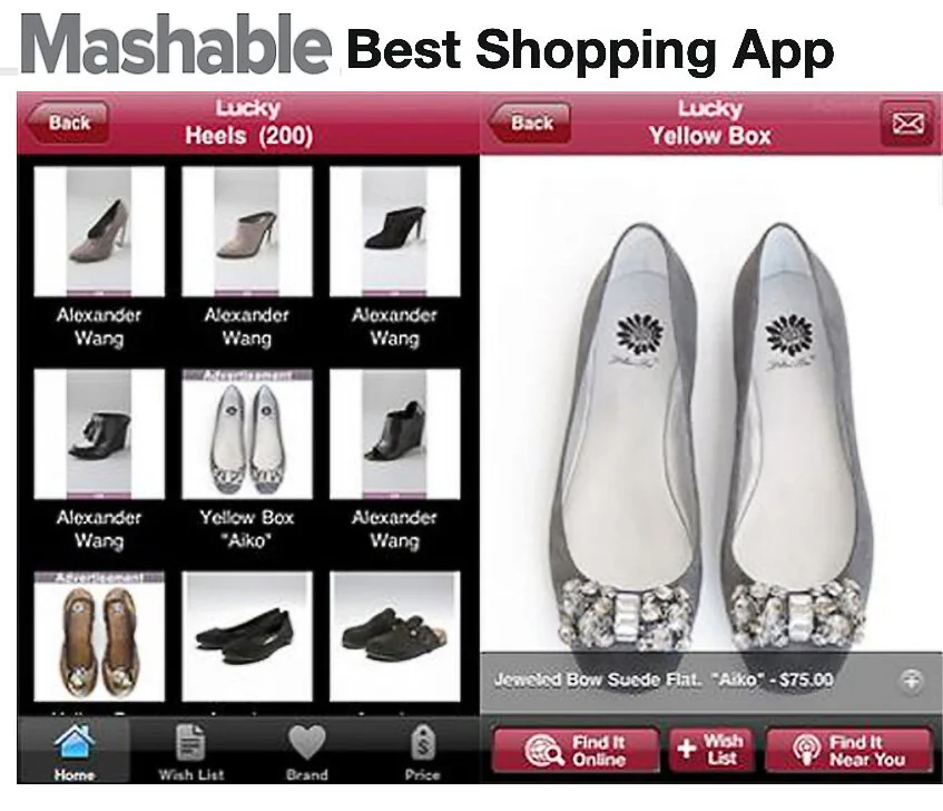
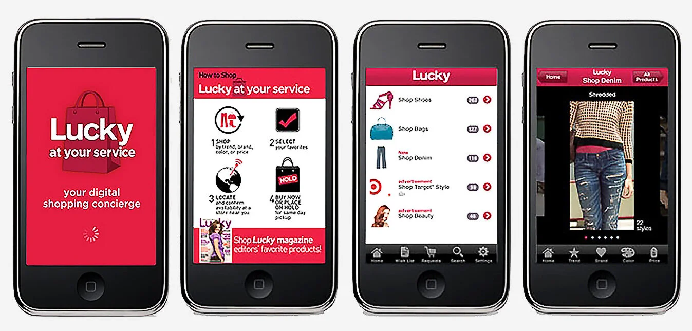
LUCKY MAGAZINE SHOPPING APP Lucky was the first magazine to launch an App at Condé Nast, Featured in the New York Times, The Wall Street Journal, The Post and others. We launched on Taxi TV during NYC fall fashion week. See the video here.
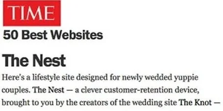
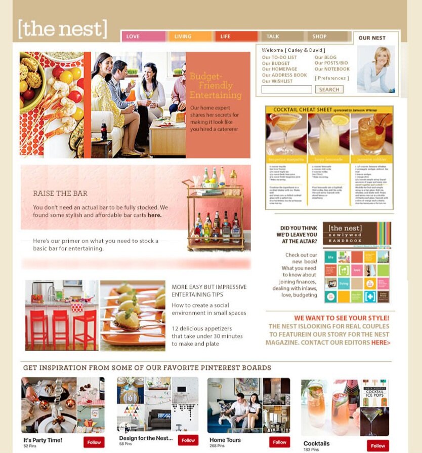
THEKNOT.COM + THENEST.COM: REDESIGN AND BRANDING, DESIGN/UI. The Knot.com was launched as "an alternative to the “stuffier” wedding brands and quickly became the #1 brand, with books, branded products, even a TV show. The success of
The Knot led to the creation of The Nest: advice and tips for newlyweds. We brought order and an upscale look to the ever-expanding Knot site, and then created The Nest brand, magazine and site. The two brands had to live together, but be distinctive and speak to their particular "lifestages."